INTERPRETATION OF PEARSON's CORRELATION COEFFICIENT
- RDSTATISTICS

- Feb 18, 2021
- 4 min read
Hi Readers! In this blog, I shall try to explore the various possibilities of the Pearson's Correlation Coefficient, how diagram gives life to the data, how often correlation is misinterpreted, and so on. I stressed on making the concepts more intuitive for the ease of the learners.
Pearson’s correlation coefficient is represented by the greek word rho for the population parameter and r for a sample characteristics. This coefficient is a vector quantity and is a single number that measures both the strength and direction of the linear relationship between two continuous variables. Studies found that the range of this coefficient range from -1 to +1.
STRENGTH: The absolute value irrespective of the sign determines the strength of linear relationship. The greater the absolute value of the coefficient, the stronger the relationship.
The extreme values of -1 and 1 indicate a perfectly linear relationship where a change in one variable is accompanied by a perfectly consistent change in the other. For these relationships, all of the data points fall on a line. In practice, you won’t see either type of perfect relationship.
A coefficient of zero represents no linear relationship at all. As one variable increases, there is no tendency in the other variable to either increase or decrease.
When the value is in between 0 and +1/-1, there is a relationship, but the points don’t all fall on a line. It may look like the data points have the tendency to hug the line of best fit. As r approaches -1 or 1, the strength of the relationship increases and the data points tend to fall closer to a line.
DIRECTION: The coefficient sign represents the direction of the linear relationship.
Positive coefficients indicate that when the value of one variable increases, the value of the other variable also tends to increase. Positive relationships produce an upward slope of the spectrum of the data points on a scatterplot.
Negative coefficients represent arises when the value of one variable increases, the value of the other variable tends to decrease. Negative relationships produce a downward slope of the spectrum of the data points on a scatterplot.
GRAPHS FOR DIFFERENT CORRELATION
Graphs always help bring concepts to life. The scatterplots below represent a spectrum of different relationships.
Correlation=+1: Perfect Positive Relationship

Correlation=0.8: Fairly Strong Relationship

Correlation=0.6: A Moderate Positive Relationship

Correlation=0: No Relationship

Correlation=-1: A Perfect Negative Relationship

Correlation=-0.8: A Fairly Strong Negative Relationship

Correlation=-0.6: A Moderate Negative Relationship

The scatterplots above are the visual representation of the strength of correlation any two variables hold. It is evident from the scatterplots that closer the data points to the line, the stronger the correlation between two variables.
The common misinterpretation of the negative correlation is that negative correlation implies there is no relationship between a pair of variables. This is WRONG! It is trivial for some pair of variables to have a negative correlation. It is just that high values of one variable are associated with low values of another variable. For example there is negative correlation between the inflation and the expenditure on luxurious items. As inflation increases, the tendency of the consumer spending on the luxurious item decreases.
PEARSON’s CORRELATION MEASURES LINEAR RELATIONSHIP
Pearson’s correlation measures only linear relationships. Consequently, if your data contain a curvilinear relationship, the correlation coefficient will not detect it. For example, the correlation for the data in the scatterplot below is zero. However, there is a relationship between the two variables: it’s just not linear.
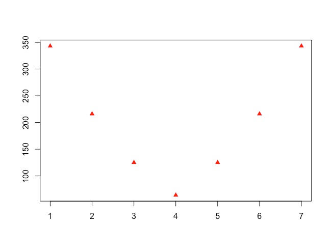
This example illustrates the reason to graph your data! Just because the coefficient is near zero, it doesn’t necessarily indicate that there is no relationship.
HOW STRONG A CORRELATION SHOULD BE ?
Have you ever asked yourself how strong the correlation should be? What is a good correlation? I have come across several articles that attempt to classify correlations as strong, medium, and weak. However, there is only one better possible answer. The correlation coefficient should accurately reflect the strength of the relationship. Take a look at the correlation of 0.8. It’s not a very strong relationship, but it accurately represents our data.
The strength of any relationship naturally depends on the specific pair of variables. Some research questions involve weaker relationships than other subject areas. The most crucial point is that humans are hard to predict. Studies that assess relationships involving human behaviour tend to have correlations weaker than +/- 0.6.
However, if you analyze two variables in a physical process, and have very precise measurements, you might expect correlations near +1 or -1. There is no one-size fits all type of answer for how strong a relationship should be. The correct correlation value depends on your study area.
CORRELATION IS NOT CAUSATION
I’m sure you’ve heard this expression before, and it is a crucial warning. Correlation between two variables indicates that changes in one variable are associated with changes in the other variable. However, correlation does not mean that the changes in one variable actually cause the changes in the other variable.
Sometimes it is clear that there is a causal relationship. However, in other cases, a causal relationship is not possible. For example, number of consumption days of Fast Food and heart attacks are positively correlated. Clearly, consumption of Fast Food alone does not cause heart attacks (or vice versa). Instead, a third variable, income level, causes changes in the other two variables. Higher income level increase both penchant for consuming of Fast Food and the number of consumers in the outlet, which creates the apparent relationship between consumption of Fast Food and heart attacks. However, there may exists some other variables which causes such changes predominantly. In statistics, you typically need to perform a randomized, controlled experiment to determine that a relationship is causal rather than merely correlation.
Thanks for reading :)


Comments